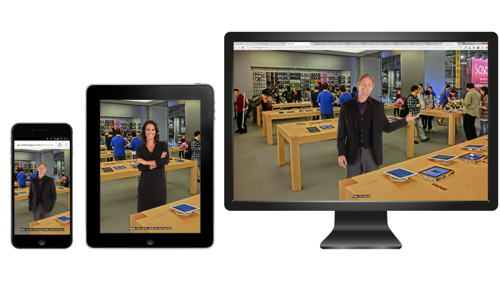
What is Responsive Design?
Responsive Design is an approach to design (particularly web design) aimed at crafting sites with a focus on ease of navigation and reading on a wide range of devices and monitor ratios, without needing the user to resize, pan and scroll. Responsive design has already been widely accepted as the future of web design (being heralded in some cases as the true web 3.0 experience), firmly establishing itself as one of the biggest advances in recent memory, and by far one of the most important for user experience.
The challenges of designing for everyone
Creating content that adapts to the user’s device is something historically considered really expensive. Each device and screen ratio would need its own layout, style sheets, and images, without even mentioning the complete reorganization of the content on the page. It would mean the creation (and subsequent maintenance) of multiple, entirely different versions of an app or website, which of course would mean satisfying users would be impossible, due to the incredible number of devices in which screen sizes and ratios changes; the mobile market in particular is guilty of this, and has been a source of strife for web designers since the rise of the iOS. Android, and mobile connectivity.
Enter Responsive Design, and its guiding principles to automate a huge part of this work, suddenly transforming total accessibility from wonderful dream to incredible reality.

Responsive Design and accessibility
With the rise of Responsive Design, offering content to everyone equally has become an accepted standard, something without which an app or website feels lacking at best, and amateurish at worst. Not being accessible nowadays is tantamount to being either disinterested or unwelcoming, and it damages the relations between the creator and the user. And that is not even the worst part, because inaccessible design cuts out completely a huge part of any userbase, which has different needs when it comes to browsing the internet due to a variety of impairments: a huge barrier to a user with problems of vision may be utterly bypassed with the simple addition of a text-to-speech option on the creator’s website, and this is just one example of the myriad that can be found online, thanks to all the research and experimentation that has been done lately in the field of accessibility.
Responsive Design, as one such accessibility feature, is not a nice bonus anymore: it’s something that any app, software or website aspiring to a medium-to-large userbase requires, and is thus absolutely necessary in e-Learning. To deliver learning materials now means to deliver accessible learning materials, ones that can be used by anyone, anywhere, with any type of device. It’s in the interest of any e-Learning provider to make their content as accessible as they can, and it is with that in mind that Chat Mapper incorporates a completely responsive HTML5 web player, assuring compatibility with every system and a great user experience on all devices.
Chat Mapper and Responsive Design
Accessibility has always been of our guiding principles here at LearnBrite HQ. Hell, we developed an entire text-to-speech solution with an incredibly lenient free license!
We think everyone should be able to access any kind of content, from any device, anywhere, and it’s with that in mind that we build our HTML5 web player to also incorporate Responsive Design before any other e-Learning solution, and the satisfaction our users reported for that attention to detail has made all this worth it – we know have a product that can help e-Learning providers offer their content to everyone, without expensive content adaptation and testing: they are finally free to devote their resources to creating more and better content instead of having to devote them to making their existing content more accessible, because we took that burden from them and made it easy for everyone to peruse it.